Chapter 3.6: How is the virus changing over time?
One of the most important questions to ask concerning COVID 19 infections is: is the number of new infections increasing or decreasing? One way to determine this is by examining the curve of total infections over time.
import pandas as pd
import requests
import numpy as np
import matplotlib.pyplot as plt
from functions import logarithmic, exponential, plot_first_derivitive, plot_second_derivitive, clean_deaths, calculate_infection, first, second
Figure #1
logarithmic()
/Users/abigaylemercer/Desktop/Jupyter/jupyterProject/functions.py:14: RuntimeWarning: divide by zero encountered in log
  y = (np.log(x) + 2) * 10000
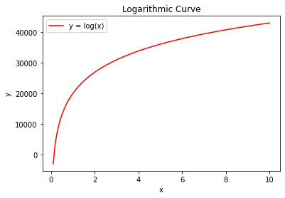
Figures 1 and 2 are examples of the two types of curves that could represent COVID infections. The first graph displays logarithmic growth and the second increases exponentially. With a complete graph, it’s not difficult to tell the difference between the two. Imagine, however, if I stretched these two graphs out, or if you could only see the very beginning of the curves. It would be very difficult to determine what type of graph you were dealing with. In the early stages of COVID 19, there simply isn’t enough data to construct a graph complete enough to determine ‘flatness’ on visual analysis alone. Fortunately, there are some simple calculus tools that can help to easily distinguish the curve of a line. Derivatives calculate the rate of change of a function. For example, the derivative of the second graph will have a positive slope because it increases at an increasing rate as x changes. Conversely, the first graph will have a negative slope because it approaches a net change of zero as x increases.
Figure #2
exponential()
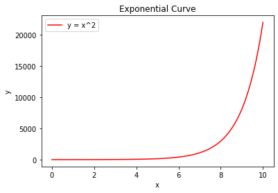
Furthermore, there are also second derivatives, which calculate the rate of change of the rate of change of a function; they are the derivative of the derivative. If the second derivative of a function is positive, then the original function will look something like the second graph, and vice versa. If a second derivative is zero, this indicates that the original function is linear. In the case of COVID 19 cases, while not ideal, this is the type of graph we would expect infections to follow. Given what I know about the second derivative of a function, taking the second derivative of the estimated infections should yield a graph that provides a clear indication of the curve of the infection slope. I graphed a red bar at zero in the graphs of second derivatives to help evaluate if the graph is positive, negative, or zero. The further the plot is in the red shaded region, the closer the rising infection graph is to Figure #2’s trajectory. The further the plot is in the blue shaded region, the closer the infection graph is to Figure #1’s trajectory. I also took derivatives of the curvefit models I used in Chapter 3.5, rather than the original infection estimates. This was done to smooth out the derivatives, as they were greatly affected by the variance in the data.
deaths_df = pd.read_csv('https://raw.githubusercontent.com/CSSEGISandData/COVID-19/master/csse_covid_19_data/csse_covid_19_time_series/time_series_covid19_deaths_US.csv')
deaths_df = clean_deaths(deaths_df)

deaths_df_CK = deaths_df.iloc[610,:]
deaths_df_CK = deaths_df_CK.reset_index()
index_val = len(deaths_df_CK.index)

calculate_infection(deaths_df_CK, index_val)

deaths_df_CK = deaths_df_CK[0:-18]

index_val = len(deaths_df_CK)

one = first(deaths_df_CK, index_val)
two = second(deaths_df_CK, index_val)
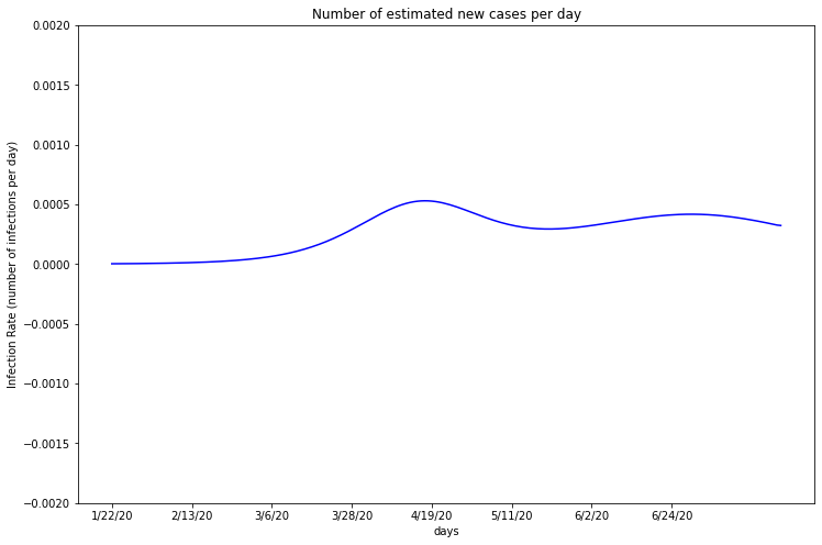
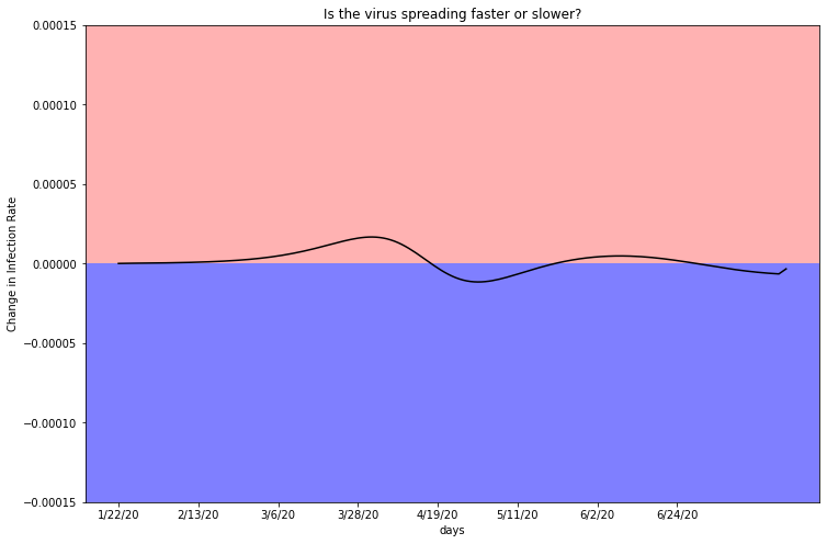
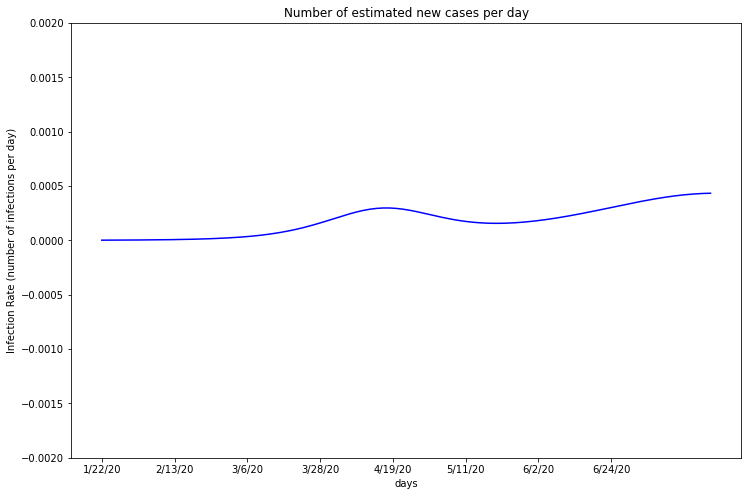
Cook
plot_first_derivitive(deaths_df_CK, one, 5150233)
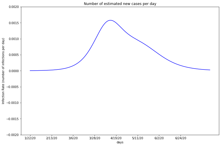
This graph is a representation of the infection rate as a percent of the total population of Cook County. For objective comparison, all the derivatives are normalized by population.
Remember, Cook’s estimated infections first increased exponentially and then followed a logarithmic curve. The first derivative follows an overall positive slope and then negative, which matches this. As the infection rate approaches zero, Cook County’s total infections will eventually cap.
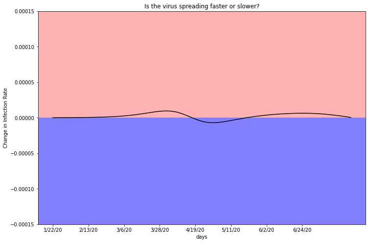
plot_second_derivitive(deaths_df_CK, two, 5150233)
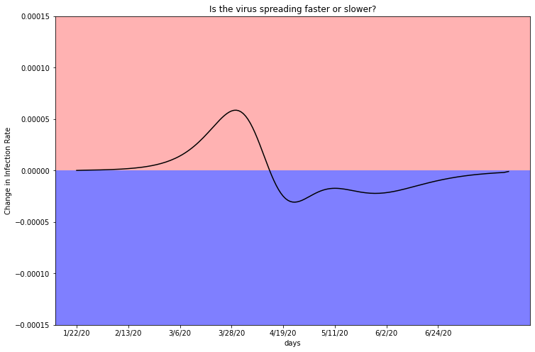
As indicated by case rate, the second derivative, or change in infection rate, hovers above zero in the red shaded region. As the total infection graph turns over, the rate of infection rate trends toward the blue highlighted region. You can see that there is a ‘blip’ in the graph around the beginning of May. If this graph were a perfect representation of a population’s infection rate without any human intervention, there would be a perfect smooth curve up into the red and then below into the blue. This blip is indicative of an infection spike. A spike could be caused by a group of businesses opening up, a protest rally, or change in policy. In the next chapter, I look into how potentially important events correspond to infection rates across counties.
deaths_df_LA = deaths_df.iloc[204,:]
deaths_df_LA = deaths_df_LA.reset_index()
index_val = len(deaths_df_LA.index)

calculate_infection(deaths_df_LA, index_val)

deaths_df_LA = deaths_df_LA[0:-18]

index_val = len(deaths_df_LA)
one = first(deaths_df_LA, index_val)
two = second(deaths_df_LA, index_val)
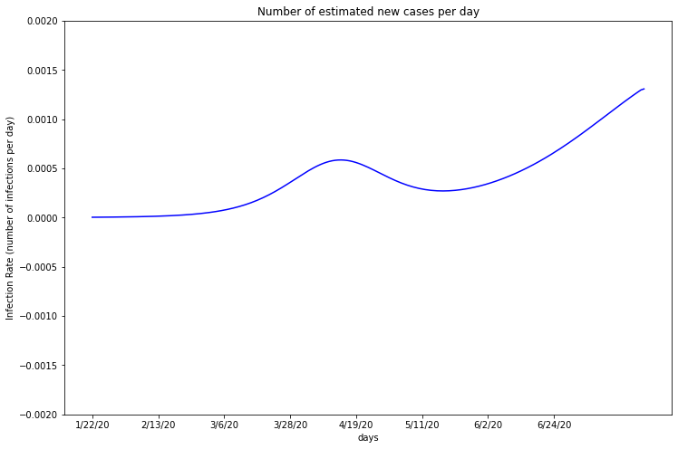
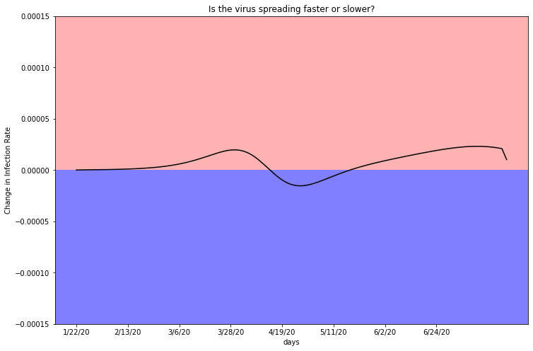
Los Angeles
plot_first_derivitive(deaths_df_LA, one, 10039107)
This graph displays only a slight fluctuation in case rate, generally only affecting .1% of the population each day. This consistency suggests the virus is spreading at a general linear rate.
plot_second_derivitive(deaths_df_LA, two, 10039107)
This graph confirms a relatively constant case rate, as it dips above and below the zero line multiple times. A function will only have a second derivative of zero if it progresses linearly. In the case of viral infections, this can mean either there are no new infections, hence a linear rate of zero, or infections are rising at a linear rate with no sign of speeding up or slowing down. The original graph of total infection estimates, displayed in Chapter 3-2, demonstrates that LA County has not turned over and infections continue to rise.
deaths_df_HR = deaths_df.iloc[362,:]
deaths_df_HR = deaths_df_HR.reset_index()
index_val = len(deaths_df_HR.index)

calculate_infection(deaths_df_HR, index_val)

deaths_df_HR = deaths_df_HR[0:-18]

index_val = len(deaths_df_HR)

one = first(deaths_df_HR, index_val)
two = second(deaths_df_HR, index_val)
Miami-Dade
plot_first_derivitive(deaths_df_HR, one, 2716940)
Miami-Dade’s infection rate appears to have no significant increase or decrease, rising slightly above zero. Absent of any major fluctuations, this graph suggests the virus is spreading at a slow, but steady linear rate.
plot_second_derivitive(deaths_df_HR, two, 2716940)
As mentioned previously, a second derivative of zero indicates a linear case count. Despite the variance, this graph seems to have a net change of zero. Miami-Dade’s infection rate is rising as expected.
deaths_df_RS = deaths_df.iloc[218,:]
deaths_df_RS = deaths_df_RS.reset_index()
index_val = len(deaths_df_RS.index)

calculate_infection(deaths_df_RS, index_val)

deaths_df_RS = deaths_df_RS[0:-18]

index_val = len(deaths_df_RS)

one = first(deaths_df_RS, index_val)
two = second(deaths_df_RS, index_val)
Riverside
plot_first_derivitive(deaths_df_RS, one, 2470546)
Of all of the counties I researched, Riverside appears to have the lowest infection rate each day. This graph suggests that the infection rate may be rising slightly, but more data is needed to reach a conclusion. If Riverside infections are rising linearly, the slope is low and it is unlikely their healthcare system will be overwhelmed.
plot_second_derivitive(deaths_df_RS, two, 2470546)
Interestingly, the shape of this graph is remarkably similar to Miami-Dade’s second derivative. Both plots hover around the red line at zero, relflecting the consistency in the case rate above.
deaths_df_MC = deaths_df.iloc[103,:]
deaths_df_MC = deaths_df_MC.reset_index()
index_val = len(deaths_df_MC.index)

calculate_infection(deaths_df_MC, index_val)

deaths_df_MC = deaths_df_MC[0:-18]

index_val = len(deaths_df_MC)

one = first(deaths_df_MC, index_val)
two = second(deaths_df_MC, index_val)
Maricopa
plot_first_derivitive(deaths_df_MC, one, 4485414)
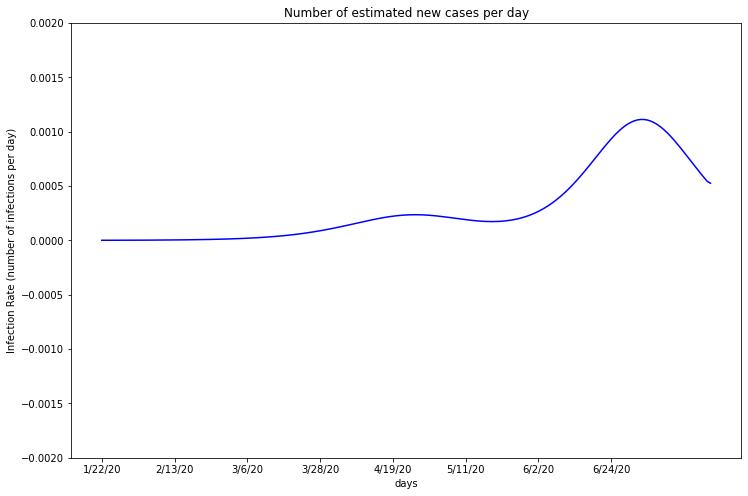
Maricopa appears to have a consistent rate of about 0.01% of the population being infected per day. In the last few weeks, however, there has been a significant increase. Maricopa County lifted their stay at home order on May 15th, which may explain the rising case rates. The graph begins its climb about 2 weeks after May 15th, which makes sense considering the virus’s 2 week average incubation period and 18 day time until death.
plot_second_derivitive(deaths_df_MC, two, 4485414)
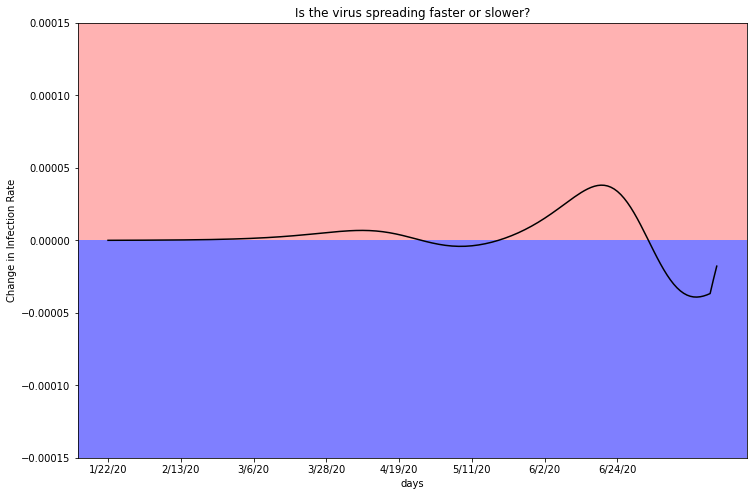
Maricopa County infections appear to continue to rise exponentially, due to the positive trend in this graph. You can see that in the last 2 weeks the plot hovers exclusively in the red shaded region. This graph is supported by the estimated infection graph in Chapter 3.3, where the plot rises exponentially.